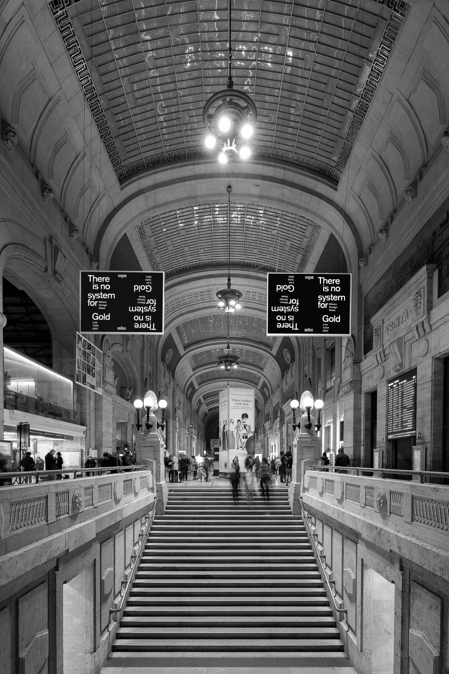
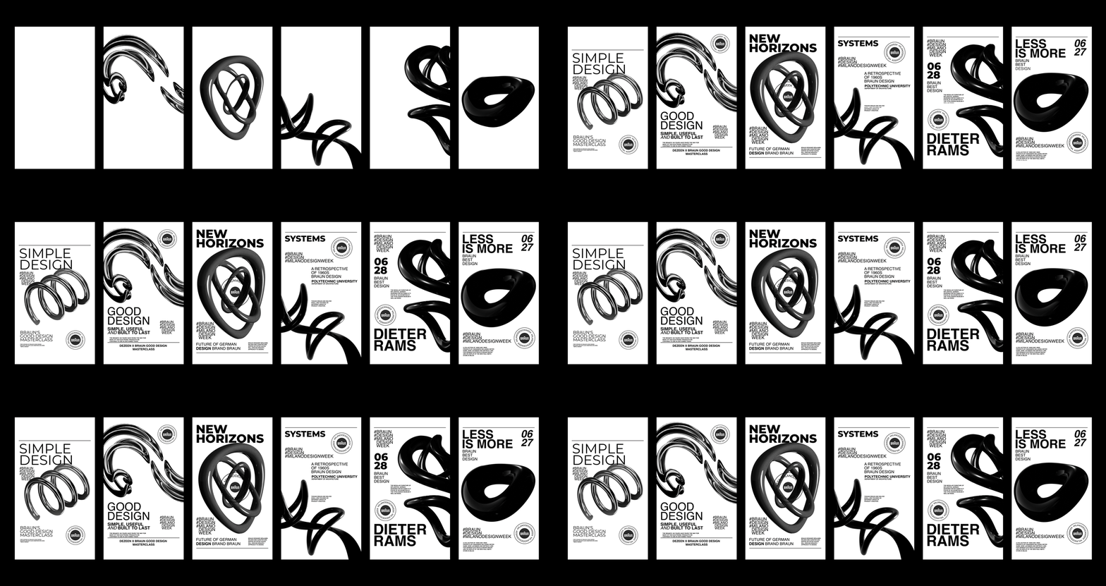
Braun
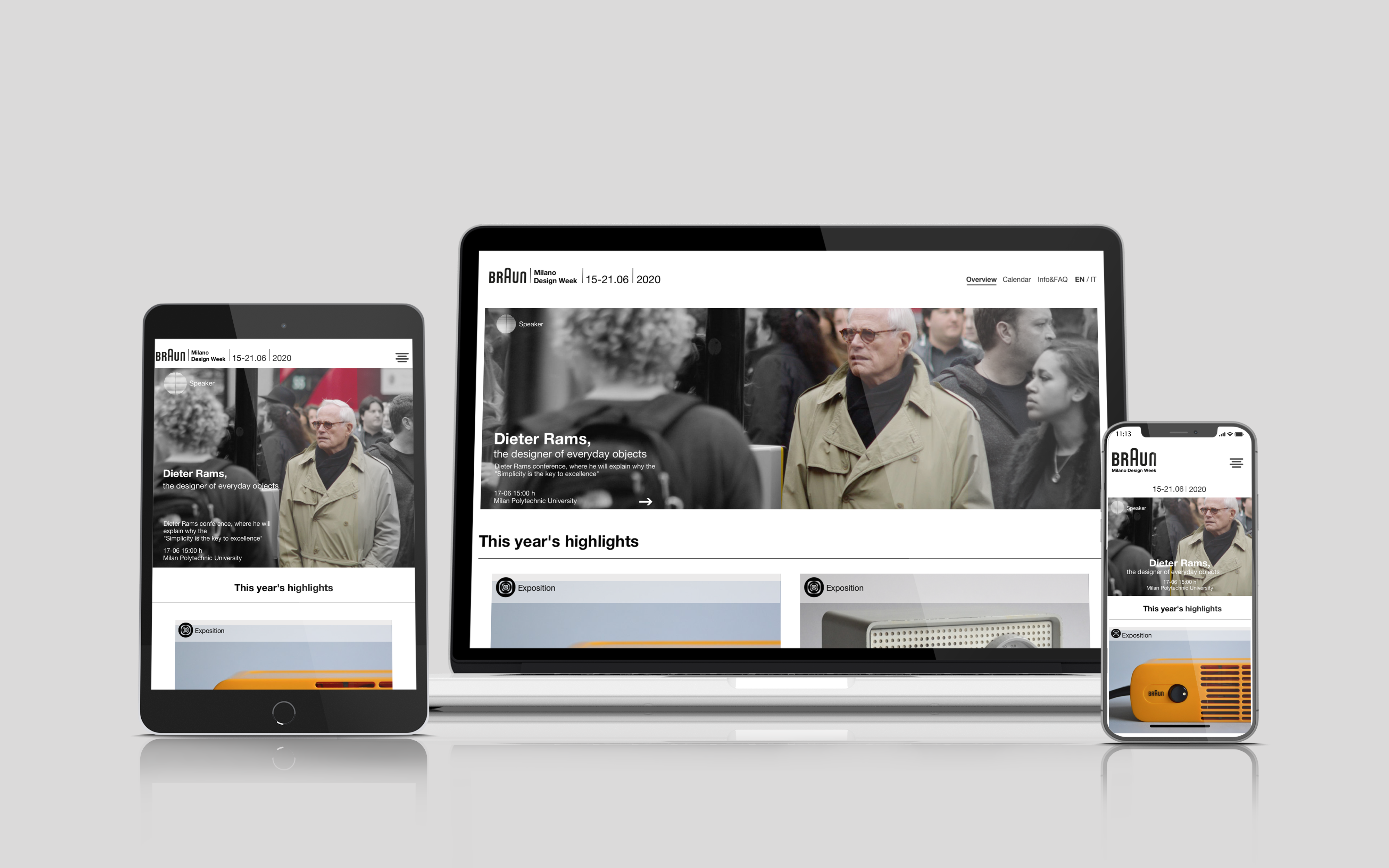
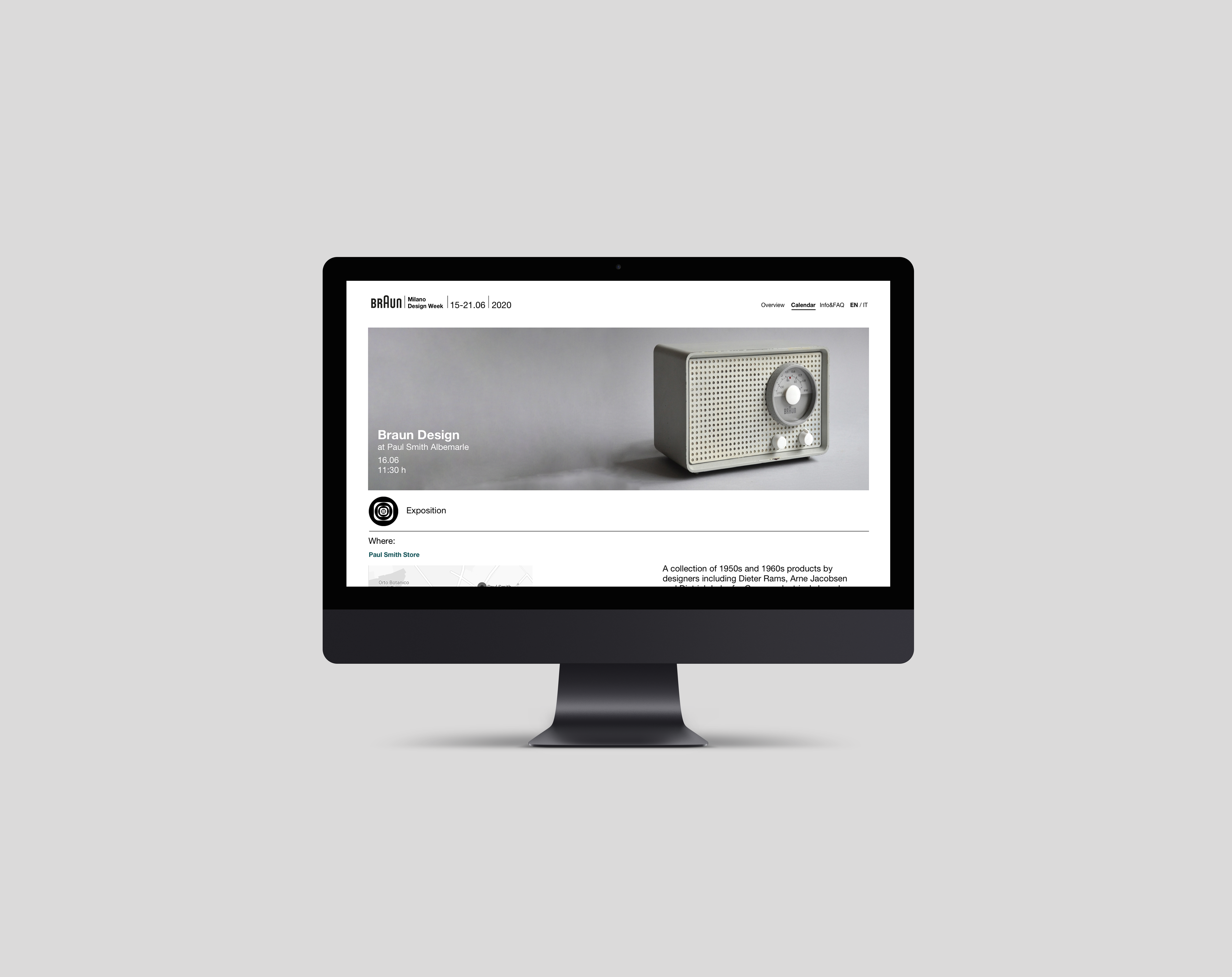
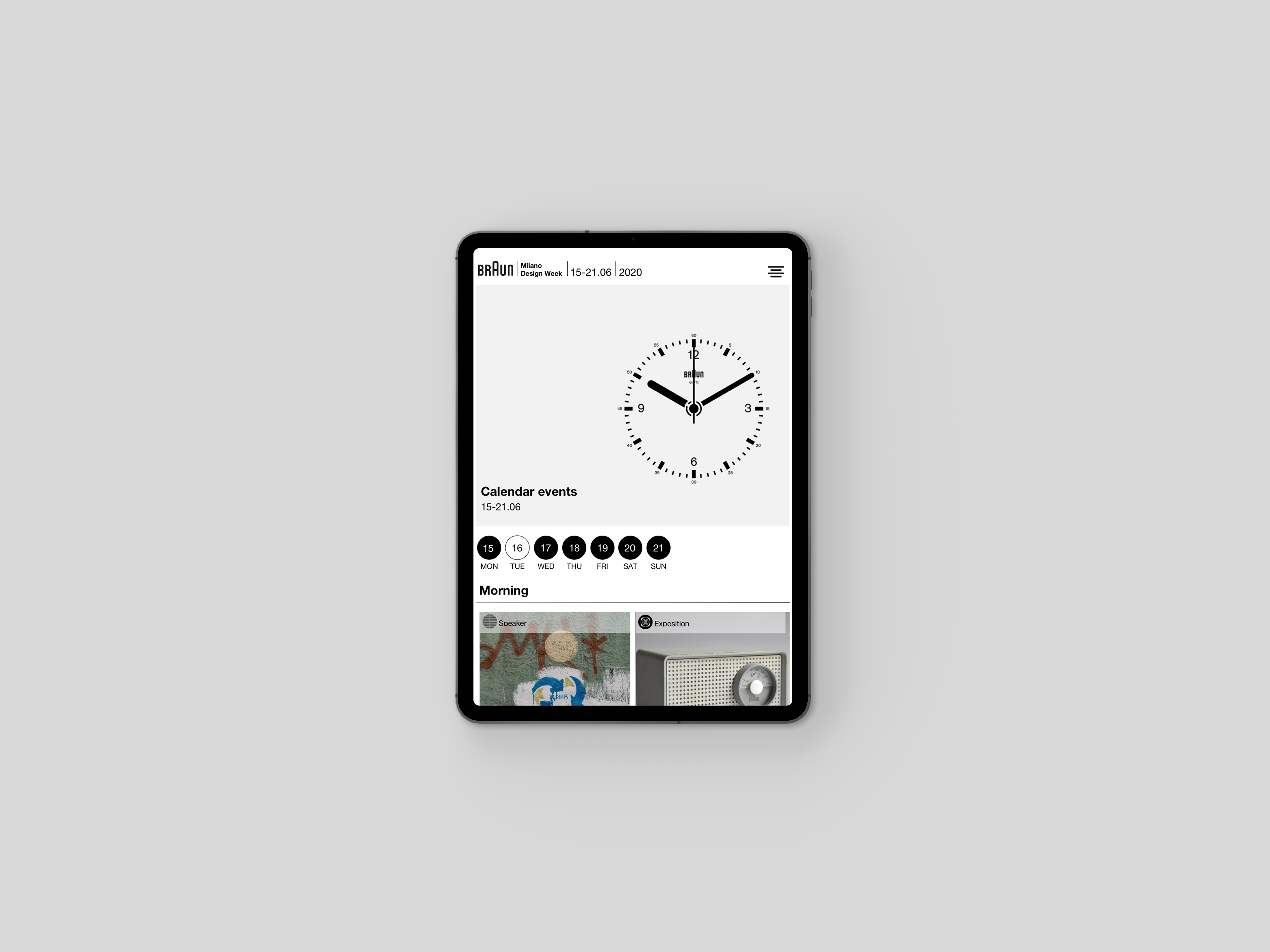
Microsite for a Milan Design Week
Media
- Brand Campaign
- Poster Design
- Web Design
- Digital
Less is More…
It is not every day that a (fictitious) project passes through your hands where the client is as important and recognized as Braun.
With great ambition to create something to match them, we take charge of creating a new digital experience.
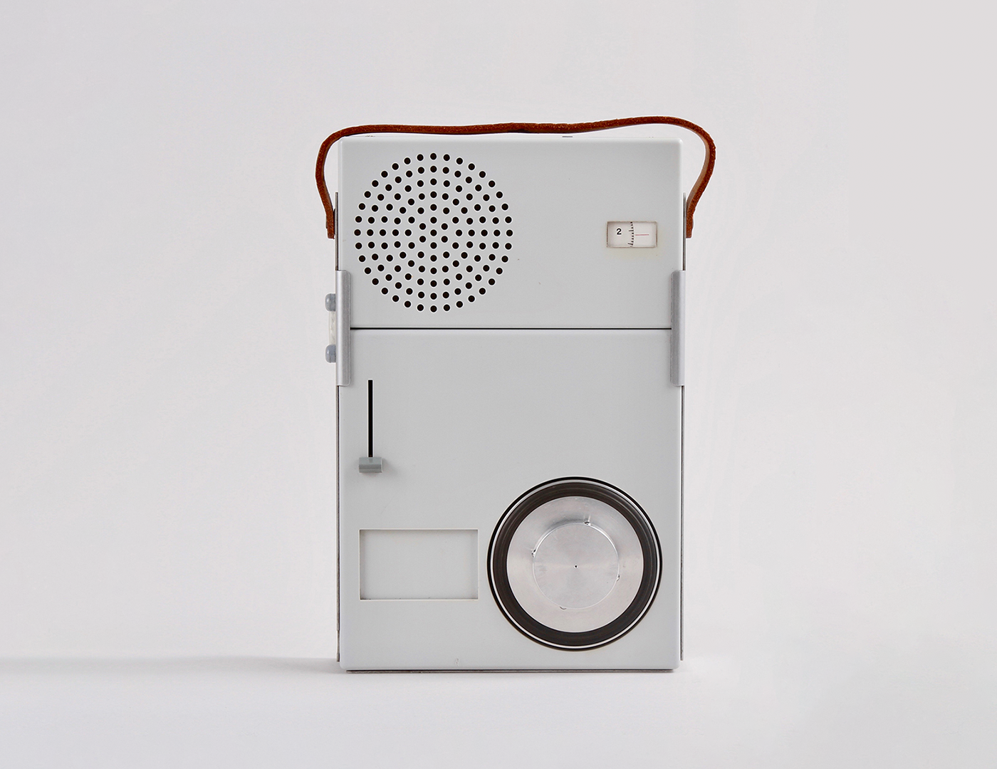
After researching the brand, we opted for a style based on the customer’s requirements: a concept that make Braun an important brand all over the world.
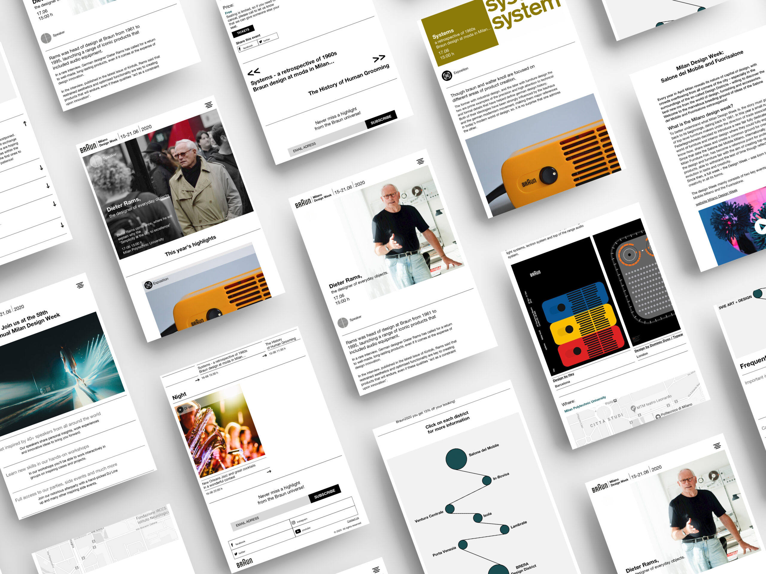
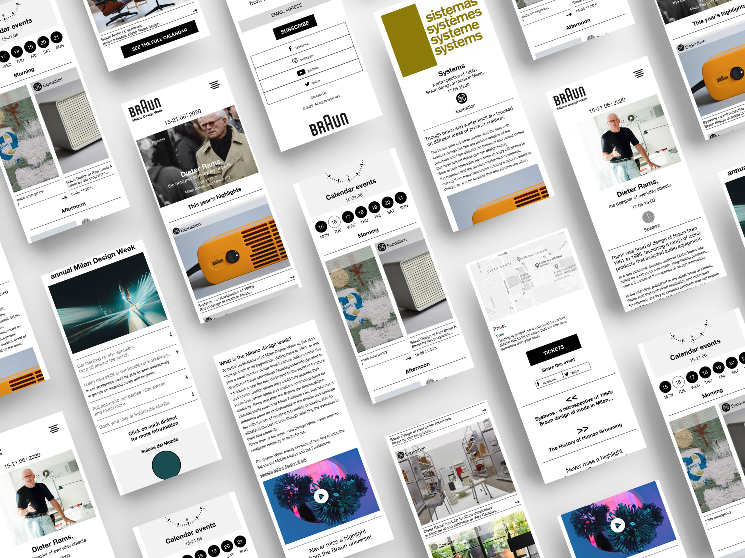
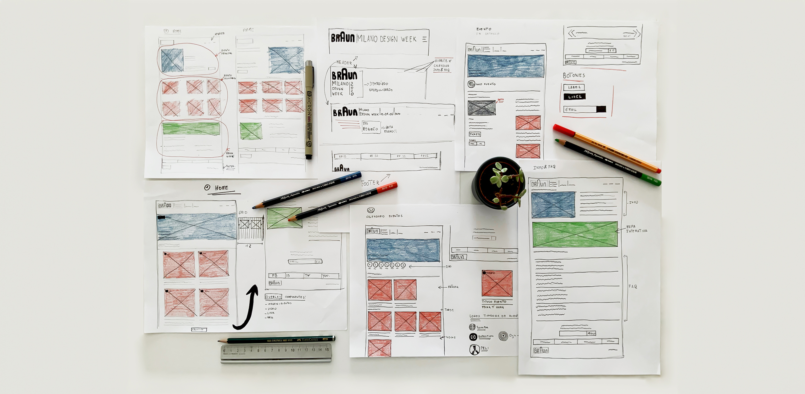
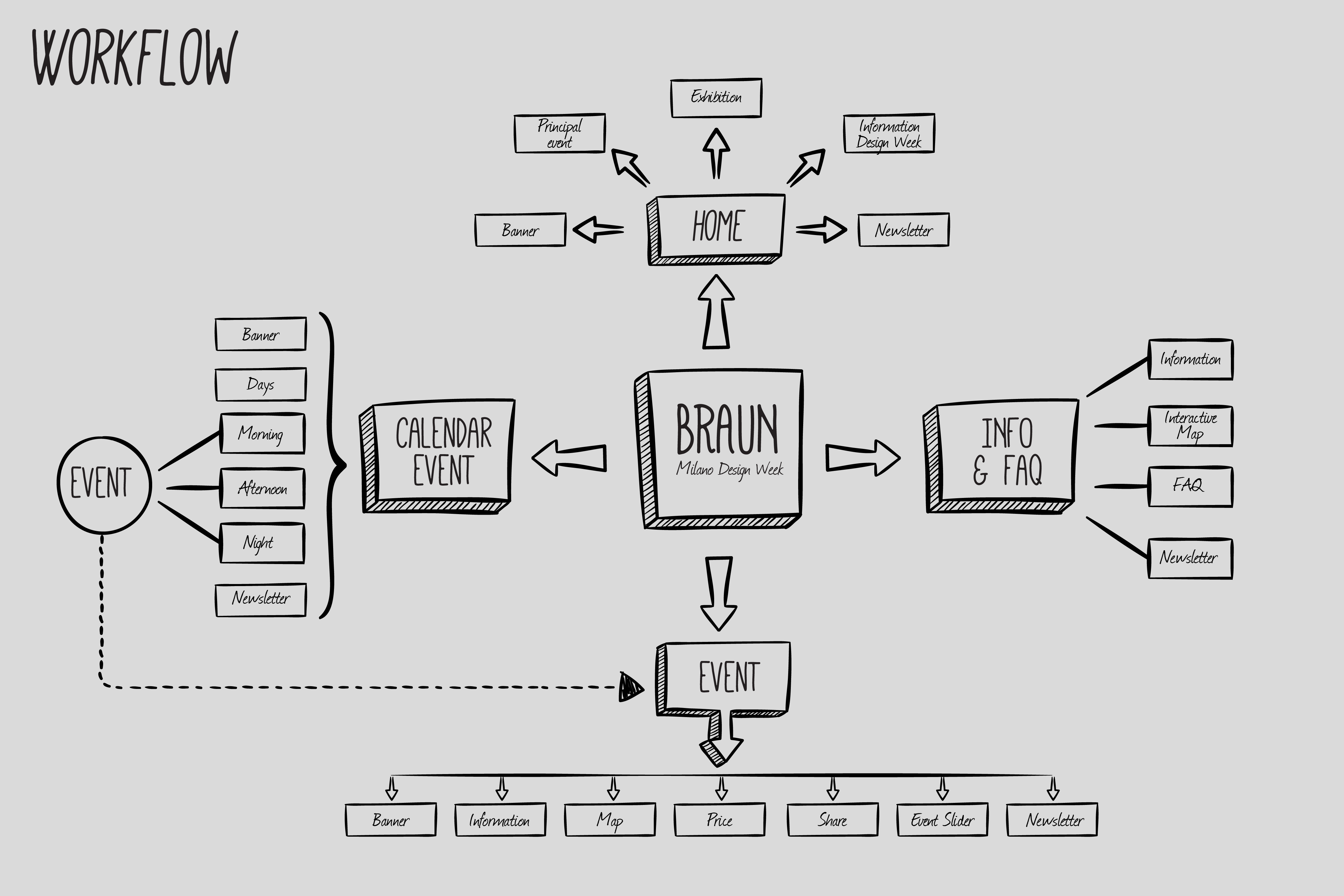
We relied on simplicity to make the microsite as functional as possible. We eliminated everything superfluous, taking into account the importance of incorporating educational information.
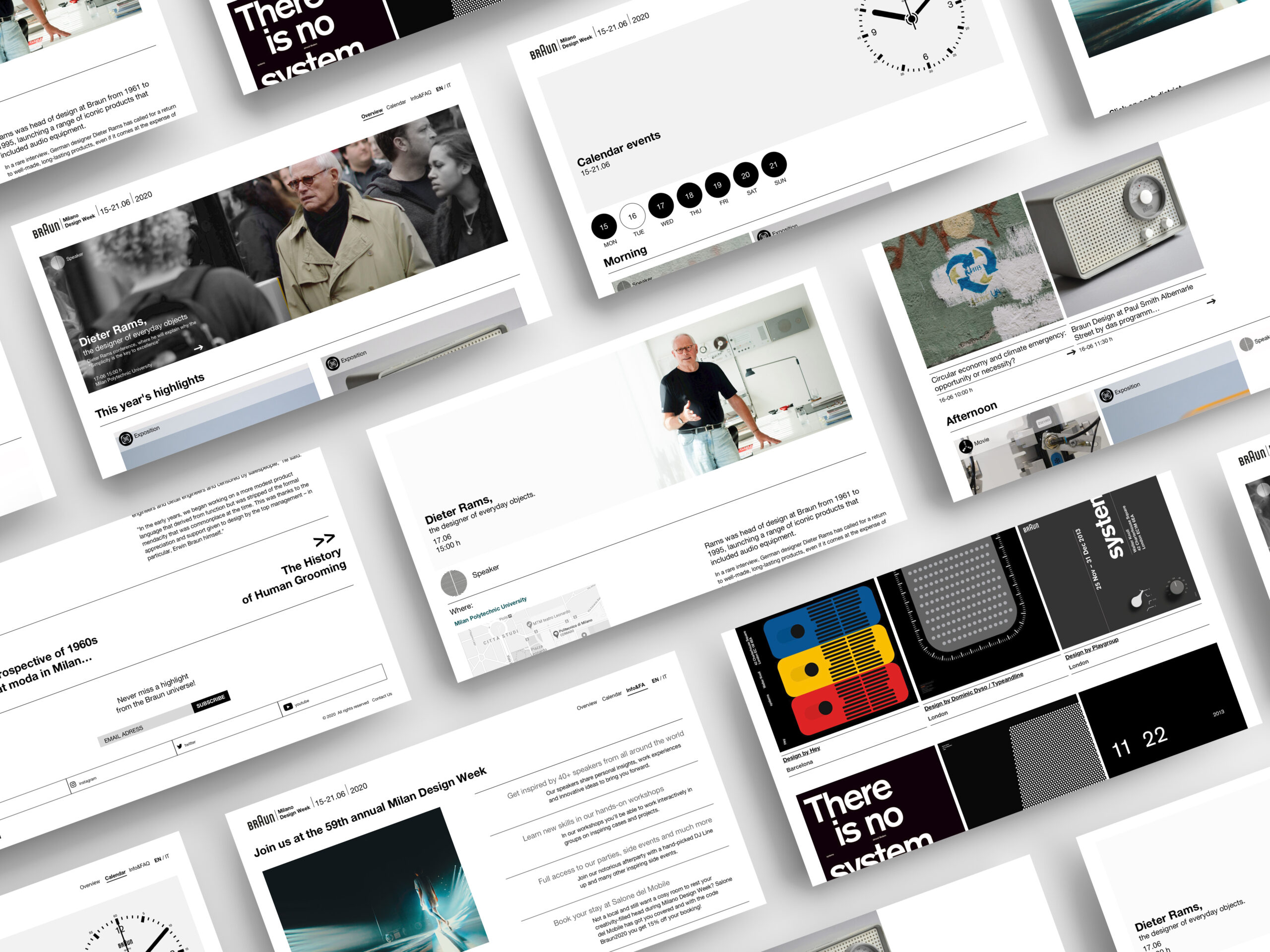
We used a geometric structure to organize all the information in a clean way so that the user can easily access it.
The main purpose of the microsite will be to facilitate the promotion of organized events, increasing visibility on the web and thus capturing greater interest from the audience and providing the opportunity to directly contact the event organizers, also establishing a feedback loop with them.

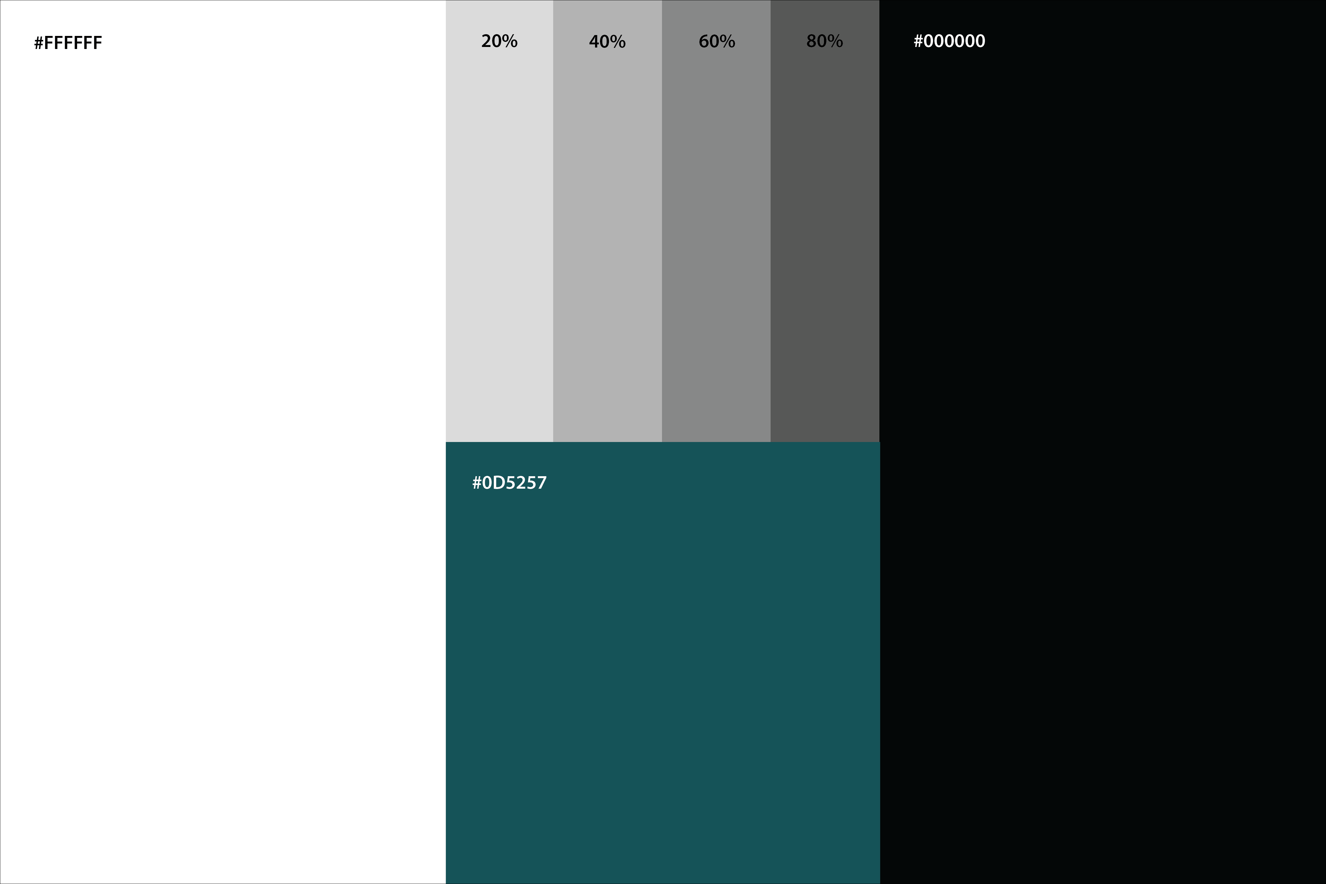
We want to use a color palette creating an authentic, honest and genuine look. We use a green/blue that approaches the most vibrant and appropriate.
The site was going to have a lot of text, so we also used a lot of white space throughout the site to improve readability. We also used black with its 20% – 40% – 60% – 80% grey tones.
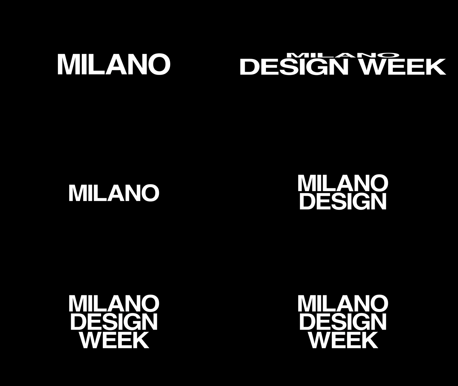
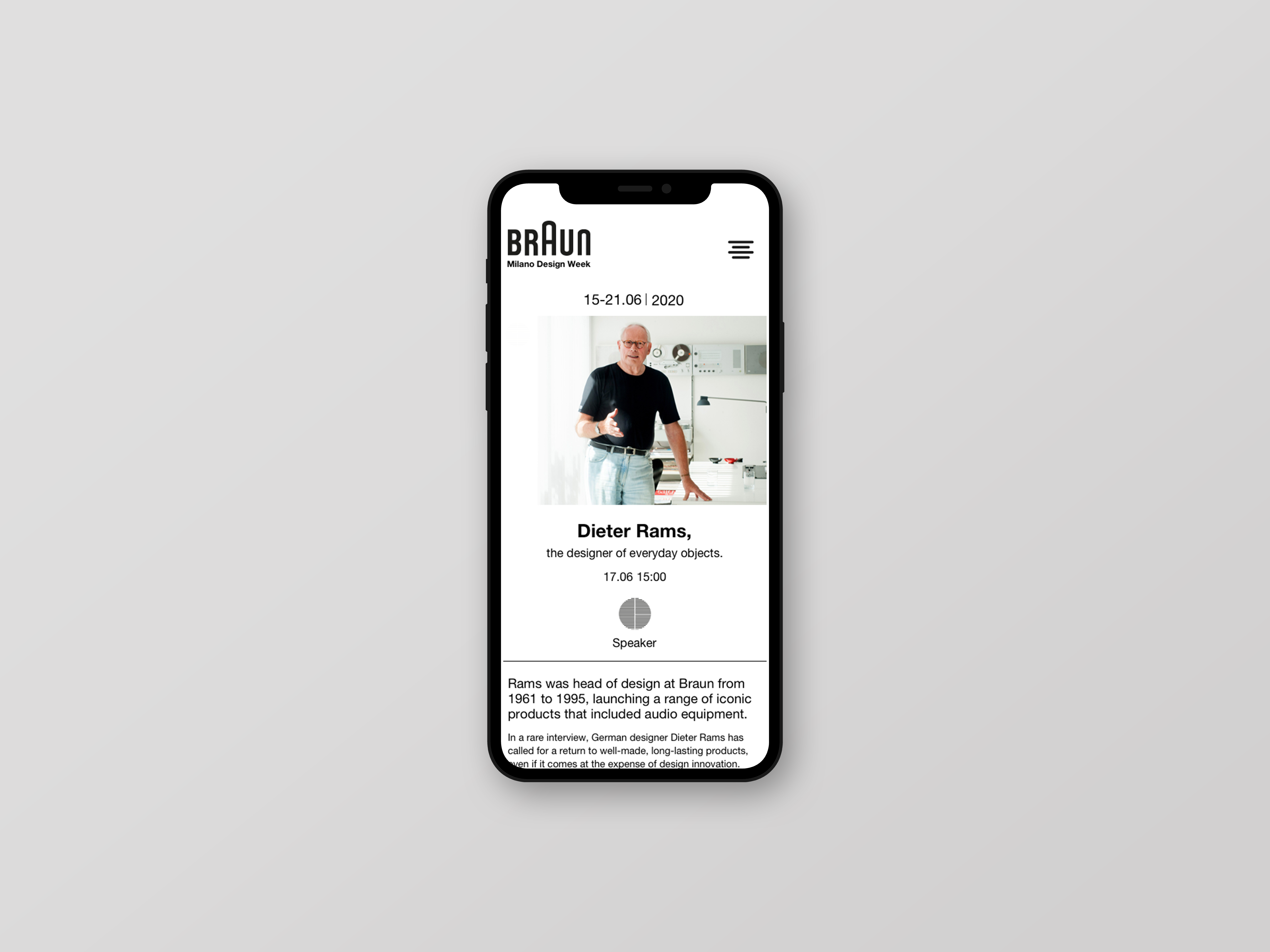
We decided that the digital experience should be modern, but with a nod to the brand’s rich and long history. On the main website they are already using Helvetica as their main font, and we felt that this modernist font, gave the right tone. We decided to keep it.
We will use Helvetica in regular and bold, for headings and components interactive, links and navigation elements and texts.
